The Billboard That Borrows a Logo: What TD's Cut-Out Campaign Teaches About Sign Placement
TD Bank's green billboards show the Nike swoosh without printing it — they just cut a window and aim at the real sign. A look at why placement, not artwork, was the creative, and what that means for your own signage.
A billboard that shows the Nike swoosh without printing one
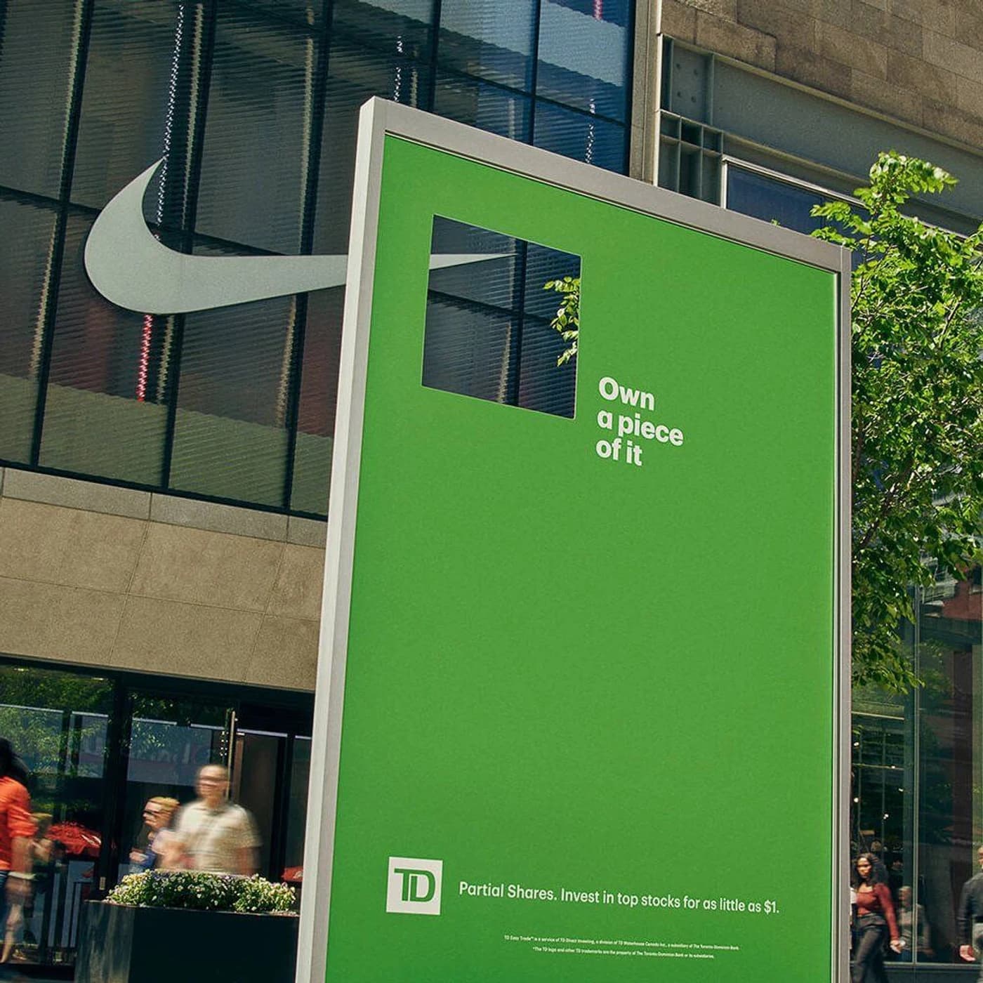
Picture a plain green billboard on a busy downtown street. There is almost nothing on it — a few words, a small logo at the bottom, and a square hole cut clean through the middle. Walk past it at the wrong angle and it reads as a mistake, like a printer ran out of ink.
Stand in the right spot and the hole fills with a Nike swoosh mounted on the building behind it. A block away, the same green panel frames the Starbucks siren. The billboard never prints either logo. It just aims at one.
That is TD Bank's "Own a piece of it" campaign, created by Ogilvy Canada and photographed by Martin Girard for Shoot Studio. It ran in 2025 to promote partial shares — the ability to buy a sliver of an expensive stock for as little as a dollar. The line at the bottom of each panel reads: Partial Shares. Invest in top stocks for as little as $1.
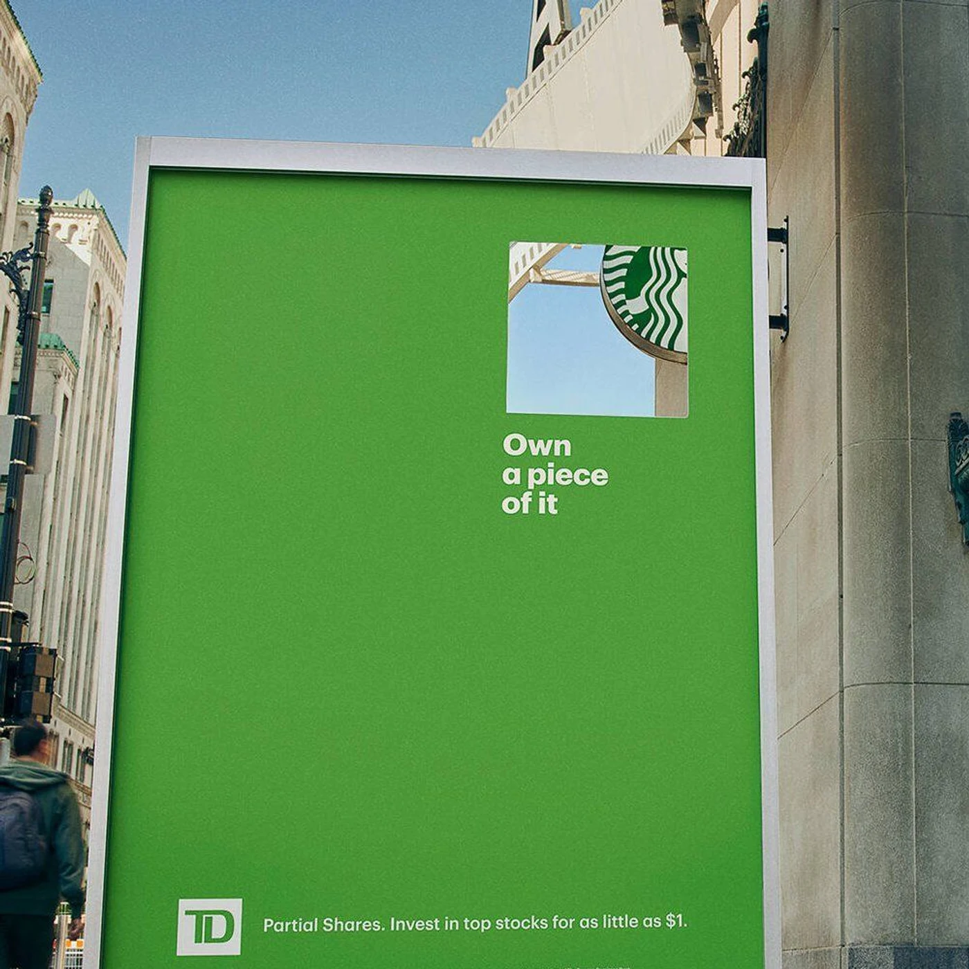
A second panel frames the Starbucks siren. The billboard prints neither logo — it aims at one. Campaign by Ogilvy Canada for TD Bank; photography by Martin Girard for Shoot Studio.
The idea and the object are the same thing
Most advertising explains a concept. This one performs it.
Fractional investing is genuinely awkward to describe. You do not own Nike. You own a piece of Nike. Say it out loud and it sounds like a technicality; put it in a brochure and you are three sentences into settlement mechanics before anyone cares.
The billboard skips the explanation. You literally see a fraction of a logo — a corner of the swoosh, part of the siren — framed inside TD's green. The window is the pitch. Nobody has to be walked through it, because understanding the sign and understanding the product are the same act.
That is rare, and it is worth naming precisely: the creative here is not the artwork. The artwork is a green rectangle. The creative is where the sign is standing.
Why it stays on the right side of the line
The campaign picked up a lot of coverage framed as a "legal loophole," because TD gets the association with Nike, Starbucks and other household names without licensing a single mark.
The useful distinction is simpler than the headlines suggest. TD never reproduced anyone's logo. It reproduced a view — the same one available to anybody standing on that sidewalk. The swoosh in the photo is Nike's own physical sign, on Nike's own building, doing what signs do. The green panel just frames it.
That is a meaningfully different act from printing a trademark on your own advertising, and it is the kind of thinking that earns a campaign its press. We are a sign company and not a law firm, so treat this as an observation rather than advice: if you are considering something in this neighborhood, the conversation to have is with your attorney, not your fabricator. The principle worth carrying away is the safe one — frame, don't reproduce.
What this is really a lesson in: placement
Strip away the finance and the trademark angle, and this is a campaign about site survey. Everything clever about it depends on facts that have nothing to do with design software:
- Which logos are physically visible from a given billboard face
- How high they sit, and how big they read at that distance
- Which sightline a pedestrian actually occupies — not where they theoretically could stand
- What time of day the light works, and when the alignment falls apart
Those are the same questions behind every good piece of exterior signage, at a much less glamorous scale. Whether a monument sign gets read at 40 mph. Whether your building letters clear the tree the city will not let you trim. Whether the awning sign is legible from the direction traffic actually approaches. Design decides whether a sign is attractive. Placement decides whether it works.
Be honest about the limits
One thing worth saying plainly, because the internet rarely does: an effect like this has a narrow aperture.
The alignment holds from one vantage point. Move thirty feet and the swoosh slides out of the window. Which means a campaign like this lives at least as much in the photography as on the street — the images are what travel, and they were shot by a professional who controlled the angle. The physical installations are real, but the audience that "got" the joke from the sidewalk is a fraction of the audience that got it from a screen.
That is not a knock. It is how modern out-of-home works: the installation earns the photograph, and the photograph earns the reach. But if you are budgeting a site-specific idea, budget the photography too, and be realistic that the in-person window is small.
It is also worth noting the dependency. TD's billboard needs Nike's sign to stay exactly where it is. Landlords re-clad buildings, tenants move, a tree fills in over one summer. Borrowed context is rented, not owned.
Four things worth stealing
You do not need a national media buy to use the thinking behind this.
1. Survey before you design. Walk the site. Stand where your customer will actually stand — in the parking lot, at the crosswalk, in the turn lane. Photograph the sightline. More sign problems come from the wrong location than the wrong layout.
2. Let the surroundings do some work. A sign does not exist on a white background. The building behind it, the traffic beside it, the light across it — those are all materials you can design with instead of against.
3. Negative space is legible at distance. The reason a mostly-empty green panel reads from across a street is that there is nothing competing with the one thing that matters. Crowded signs lose at speed, every time.
4. Make the sign do the explaining. If your offer takes a paragraph, the sign is the wrong place for the paragraph. Find the version someone understands in the two seconds they actually give you.
The takeaway
The most quietly impressive thing about "Own a piece of it" is what it does not include. No stock photography. No clever headline doing the heavy lifting. No borrowed logo sitting on TD's own artwork.
A green rectangle, a hole, and a very deliberate choice about where to stand.
That is a useful reminder for anyone buying signage. The most expensive sign in the wrong place will underperform a simple one in the right place. Before the discussion turns to materials, illumination and finishes, the question that decides the outcome is more basic — where will this be seen from, and what else is in the frame?
The same idea, working against you
The uncomfortable corollary: if your surroundings can add meaning to a sign, they can subtract it too — and you do not get a vote.
TD chose its context deliberately and got a campaign out of it. The opposite case is a McDonald's billboard where somebody climbed up with a can of dark paint, covered a couple of letters in the headline, and turned a smoothie ad into taste pee. Same fact about signage — a sign is read in a place, not on a white background — with the outcome pointed the other way.
We wrote that one up as the cautionary half of this pair: designing signs that can't be turned against you, including the one-minute proof audit that catches it before print, and the version that happens with no vandal at all when a single letter burns out.
Campaign images: TD Bank "Own a piece of it," created by Ogilvy Canada, photographed by Martin Girard for Shoot Studio. Shown here for commentary. All trademarks are the property of their respective owners.
If you are working through that question for your own building, storefront or site, that is the part we like best. Get in touch and we will walk the site with you.